Metrics
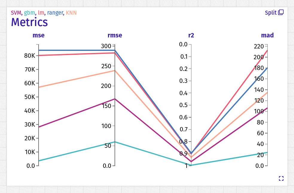 Simple chart presenting performance using one line for each model.
In regression tasks, a better model lies under worse ones.
In classification this rule is inverted.
Simple chart presenting performance using one line for each model.
In regression tasks, a better model lies under worse ones.
In classification this rule is inverted.
Receiver Operating Characteristic
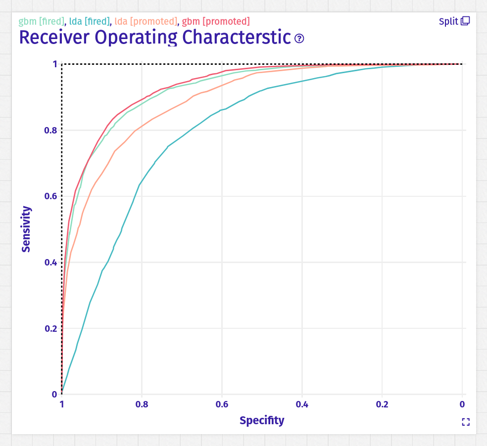 This is a well known ROC curve used in classification tasks.
For many values of cutoff algorithm measure sensitivity TP/(TP + FN) and specificity TP/(TP + FP).
You can use the mouse to check the value of the cutoff for the selected point on a curve.
This is a well known ROC curve used in classification tasks.
For many values of cutoff algorithm measure sensitivity TP/(TP + FN) and specificity TP/(TP + FP).
You can use the mouse to check the value of the cutoff for the selected point on a curve.
Connector options
create_arena(
  # Number of tested cutoffs
  grid_points = 101
)
Receiver Error Characteristic
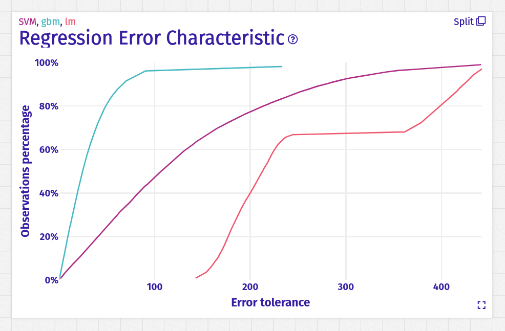 REC chart shows what percentage of observations have residual in given tolerance.
Connector options
create_arena(
  # Number of tested residuals thresholds
  grid_points = 101
)
Subset Performance
 The metrics can vary across different subsets of the testing dataset.
If our model has an accuracy of 0.9, it does not mean that for underrepresented group accuracy is also equal to 0.9.
It is important to know if some subsets of observations have worse performance.
The metrics can vary across different subsets of the testing dataset.
If our model has an accuracy of 0.9, it does not mean that for underrepresented group accuracy is also equal to 0.9.
It is important to know if some subsets of observations have worse performance.Each lollipop on this plot starts from the line representing measure for the whole dataset. A dot shows the value of the metric for one subset. Keep in mind, that the testing data frame is split independently for each variable. You can check the details of any using mouse.
For categorical variable splitting process is easy. The most numerous levels are taken. The rest are merged to the "Other" label.
Numerical variables are cut to k intervals using k-1 points. The algorithm does not take these points uniformly. It uses quantiles. For example to make 4 intervals we use 25%, 50%, 75% percentiles.
Dashboard options
- Maximum variables in one page Subset Performance
Connector options
create_arena(
  # Number of intervals for numerical columns
  funnel_nbins = 5,
  # Cutoff of frequency for categorical variables. Levels less frequent will be joined into the "Other" level
  funnel_cutoff = 0.01,
  # Numerical variables with less unique values will be treated as categorical
  funnel_factor_threshold = 7
)
Funnel Plot
 Funnel Plot bases on the presented above Subset Performance.
The main difference is the usage of these charts.
Instead of drawing raw values of metrics, the funnel plot relates every metric to the analogical metric of some primary model.
Funnel Plot bases on the presented above Subset Performance.
The main difference is the usage of these charts.
Instead of drawing raw values of metrics, the funnel plot relates every metric to the analogical metric of some primary model.One of the proposed usages is using a high-performance and black-box model as the primary one. We can compare white-box interpretable models to it. Lolipops will show the different in loss value.
Dashboard options
- Maximum variables in one page Funnel Plot
Connector options
create_arena(
  # Number of intervals for numerical columns
  funnel_nbins = 5,
  # Cutoff of frequency for categorical variables. Levels less frequent will be joined into the "Other" level
  funnel_cutoff = 0.01,
  # Numerical variables with less unique values will be treated as categorical
  funnel_factor_threshold = 7
)